Once your event goes live, this is the first place you’ll want to check. The Overview Dashboard gives you a real-time snapshot of how your event is performing — from sales and ticket types to capacity and daily trends. It’s like your front-of-house report, but smarter, prettier, and always up to date.
🧭 Where to Find It
Go to your event → click Overview in the sidebar.
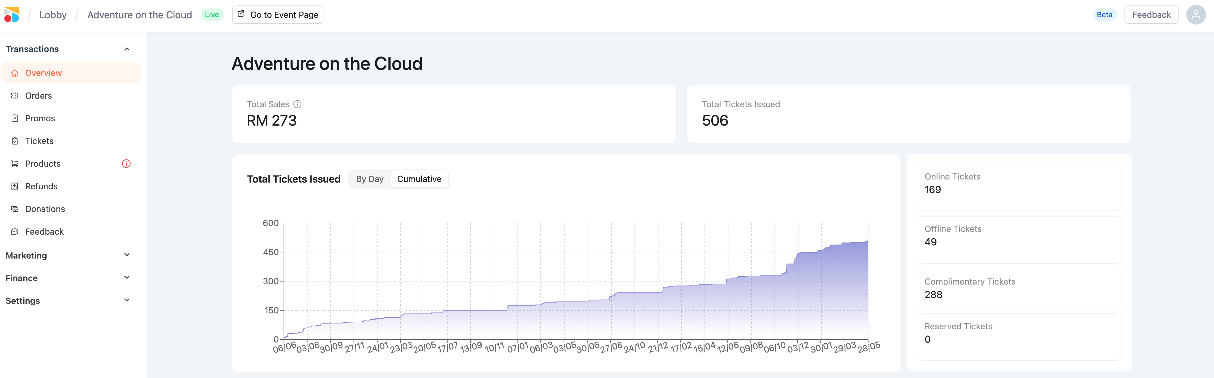
This is your command center for sales insights, fill rate, and ticket movement.
💰 Total Sales
This figure shows the total revenue collected from all paid tickets only, including both:
-
Online sales
-
Offline sales created manually
Important:
-
Complimentary tickets are not included in the totals sales
-
This amount is before service and handling fees
-
Use this as a gross sales indicator, not your payout estimate
🎟️ Total Tickets Issued
This number includes all issued tickets, such as:
-
Paid (online + offline)
-
Complimentary
If it’s been issued to a patron — it counts.
📈 Ticket Sales Graph
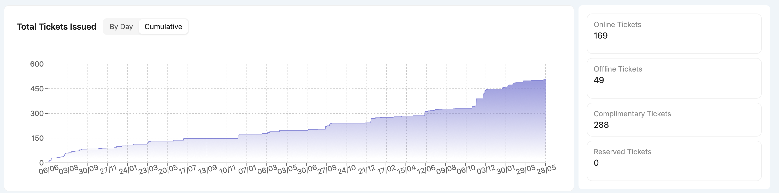
Two views:
-
By Day – see spikes or drops in daily ticket activity
-
Cumulative – monitor momentum and growth over time
Quick Notes:
-
Shows all ticket types, not just paid
-
Runs from your sales start date to end date
-
Graph is for display only — no drill-down per date (yet!)
🪑 Capacity & Fill-Up Rate
-
Capacity = total number of tickets that can be sold (based on your timing setup)
-
You can adjust this anytime via:
Settings > Ticketing > Timings > Edit
🎯 Fill-up rate includes all issued tickets (even complimentary)
Bonus: You can also limit ticket counts per tier — e.g. 300 VIP, 200 Standard.